Color Psychology
Color & Meaning in Branding: Designing Your Brand Ecosystem
Color is one of the most immediate ways people perceive a brand. It doesn’t just make your visuals look attractive, it shapes emotion, recognition, and trust, laying the foundation for a strong brand ecosystem. Just like a terrarium relies on balanced layers to thrive, your brand identity depends on a cohesive palette to guide every visual and emotional touchpoint.
Why Color Psychology Matters in Branding
Research shows that people form judgments about brands within seconds, and color is one of the most powerful influencers. Each hue subconsciously communicates qualities like trust, energy, calm, or creativity, affecting how audiences feel and engage with your brand.
In branding, inconsistent or random color choices can create friction, weaken recognition, and dilute your identity. When applied intentionally across a brand ecosystem, from your website and social media to client materials and packaging, color strengthens recognition, builds trust, and reinforces your brand personality.
Mapping Your Brand Color Ecosystem
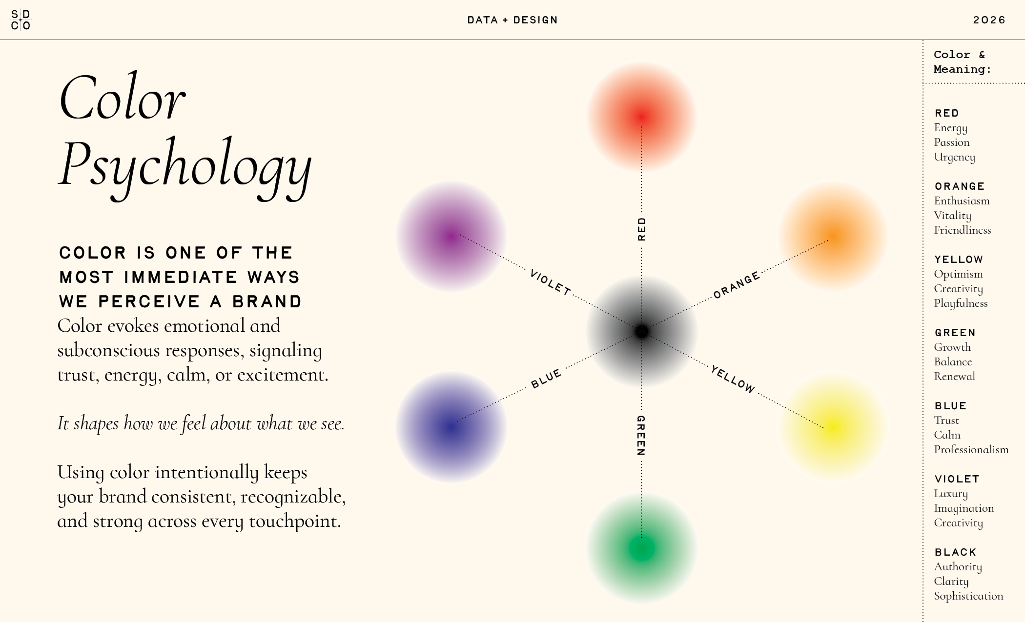
Think of your color palette as a living layer in your brand terrarium: each hue contributes to the overall environment, supporting the ecosystem of your identity. Here’s how your colors communicate subconsciously:
Red: Energy, passion, urgency — energizes calls-to-action and bold messaging
Orange: Enthusiasm, vitality, friendliness — adds warmth and approachability
Yellow: Optimism, creativity, playfulness — sparks joy and engagement
Green: Growth, balance, renewal — ideal for wellness, eco-friendly, or growth-focused brands
Blue: Trust, calm, professionalism — builds stability and reliability
Purple: Creativity, imagination, sophistication — perfect for aspirational, premium, or creative brands
Black: Authority, clarity, grounding — anchors the palette and balances brighter colors
By treating your palette as part of a larger brand system, each color complements the others, ensuring your visuals communicate consistently and effectively across all touchpoints.
Applying Color Across Your Brand Ecosystem
In a terrarium, every layer must work together: the soil nourishes plants, the foliage grows toward light, and the climate supports life. In branding, your colors function in a similar way. They guide your audience’s perception, shape emotional responses, and support the growth of your brand. Strategic color usage ensures your brand is not only visually appealing but also emotionally resonant, consistent, and memorable.
Color shapes perception. Thoughtful application across your brand ecosystem keeps your identity strong, cohesive, and instantly recognizable.
Takeaway
Your brand identity thrives like a terrarium: balanced, intentional, and alive. Treat color as a key layer in your brand ecosystem — choose hues that communicate meaning, complement each other, and reinforce your identity at every touchpoint. A cohesive palette strengthens your brand recognition, builds trust, and ensures your visuals feel unified across every medium.